AHSYLA CREATIVE
Website Redesign:
SMALL KINE
GIFT
- Client: Small Kine Gift
- Project Type: Web Development
- Software: HTML/CSS/JS, Figma, & Adobe Creative Suite
OVERVIEW
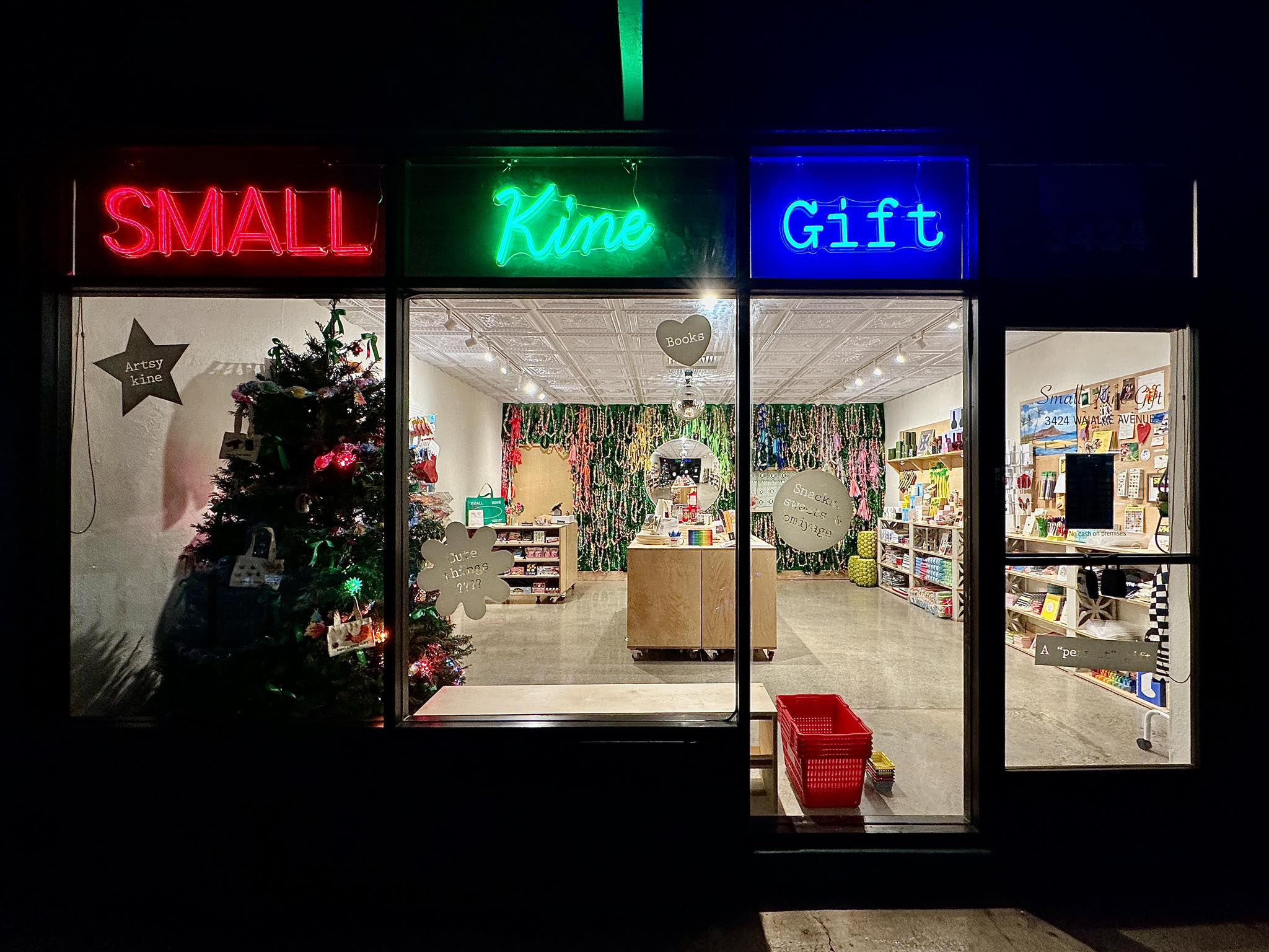
Small Kine Gift is a charming boutique in Kaimukī, Honolulu, offering a playful
mix of locally inspired goods, design-forward items, and quirky novelties.
They
have a current website that is
functional however, it doesn’t capture the
essence of the store itself. The existing website is functional and easy to
navigate, but it doesn’t fully reflect the store’s identity. It lacks the
personality and atmosphere that define the in-person experience, resulting in a
more generic feel rather than a cohesive extension of the brand.
SITEMAP
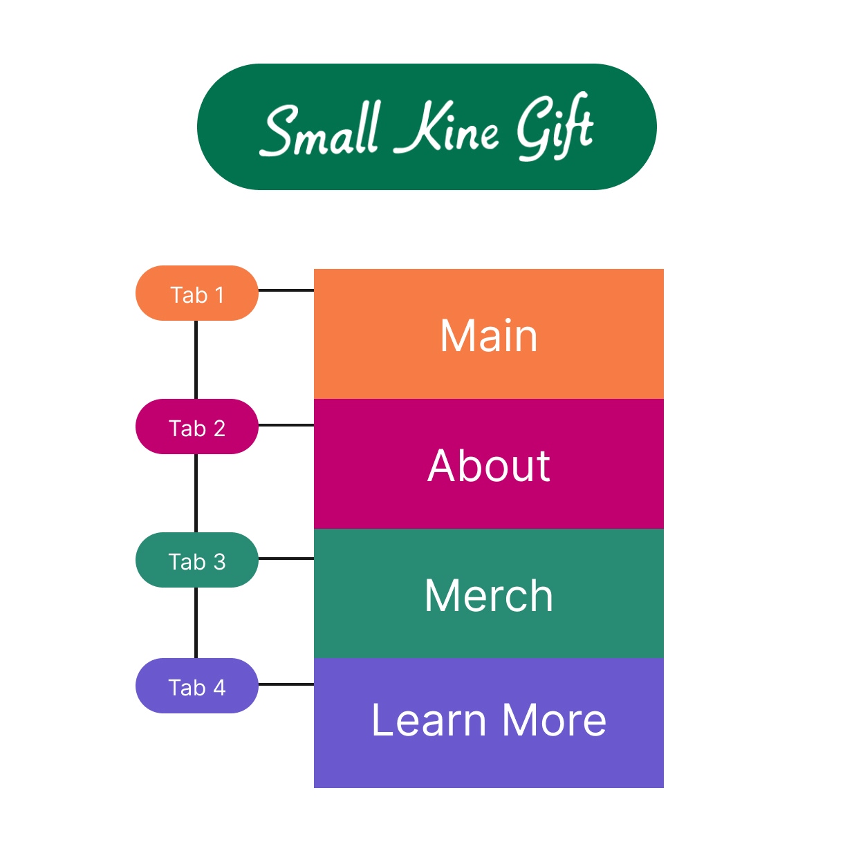
This sitemap keeps the structure simple and easy to follow, organizing the site into four main sections:
- Main: The home tab - introduction to the website.
- About: Provides information about the store and its identity.
- Merch: Showcases available products.
- Learn More: Offers additional details, resources, or extended content.
Each section is clearly separated and connected through a tab-based navigation, making the flow feel straightforward and intuitive.
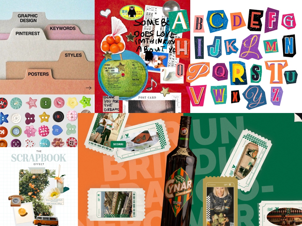
CURATING THE IDENTITY
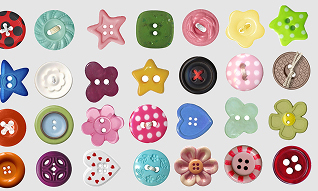
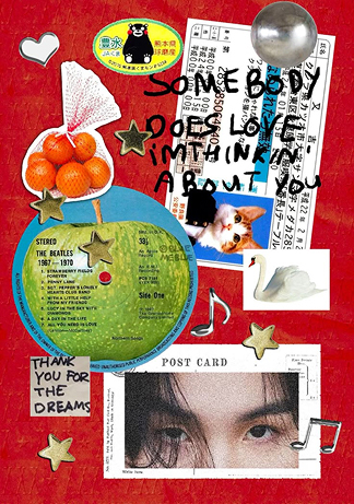
This moodboard takes on a layered, collage-style approach that feels very editorial and hands-on. It combines scanned text, printed elements, and cutouts to create depth, almost like a scrapbook or zine. The overlapping layouts and slight distortions give it a raw, experimental feel while still feeling intentional.
The curated design intentionally moves away from a strictly clean, minimal approach and instead embraces a more maximalist aesthetic. At the same time, the design still considers practicality for UI purposes.
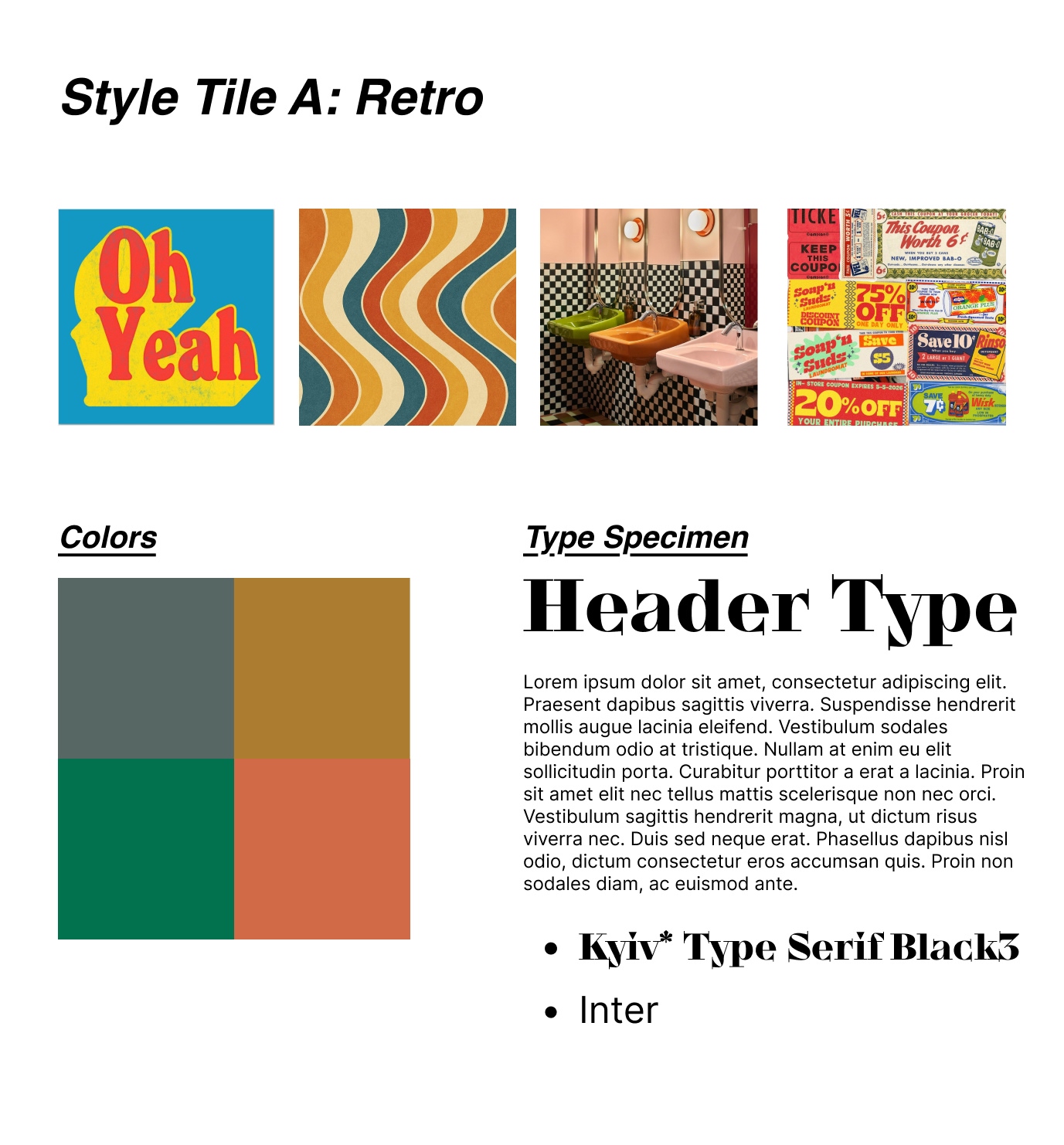
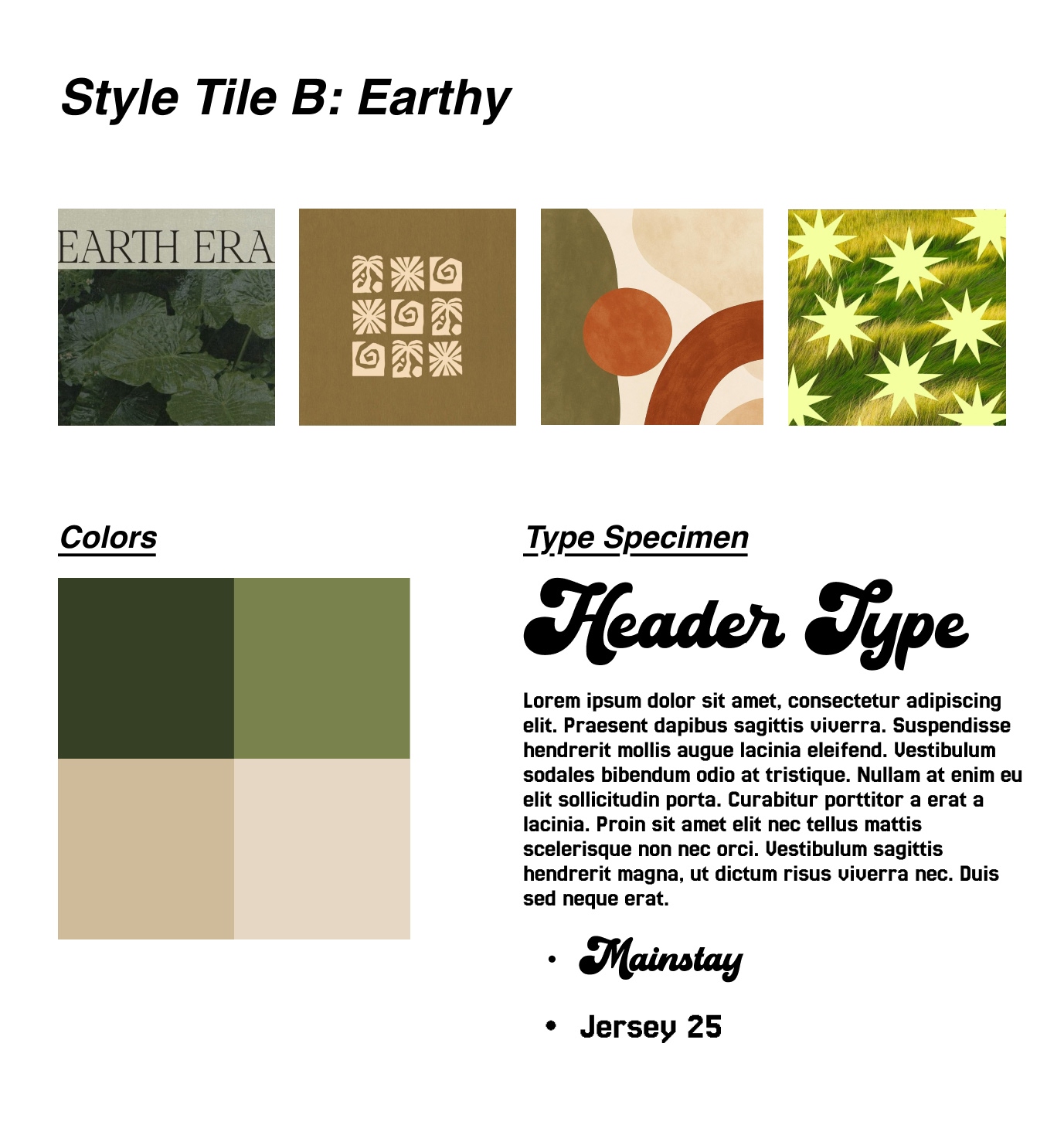
Style Tiles
Wireframe Rounds
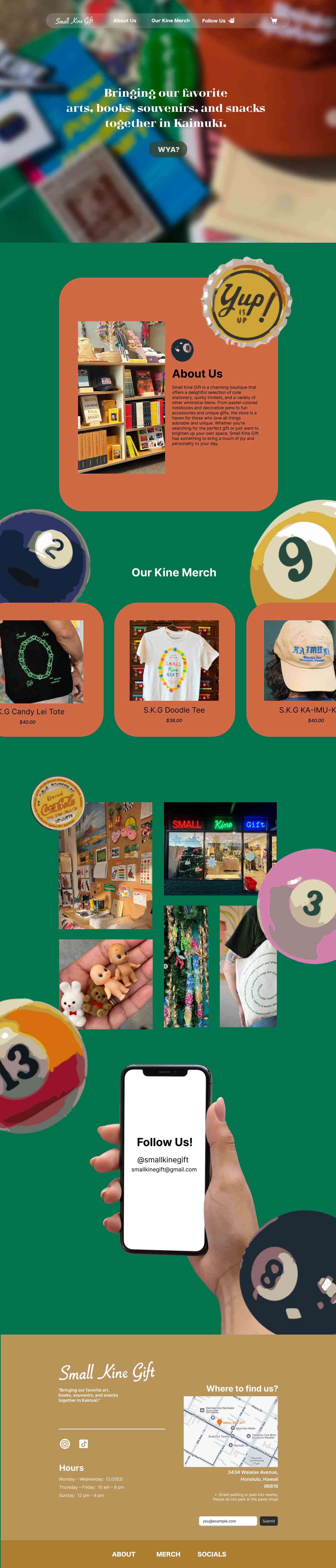
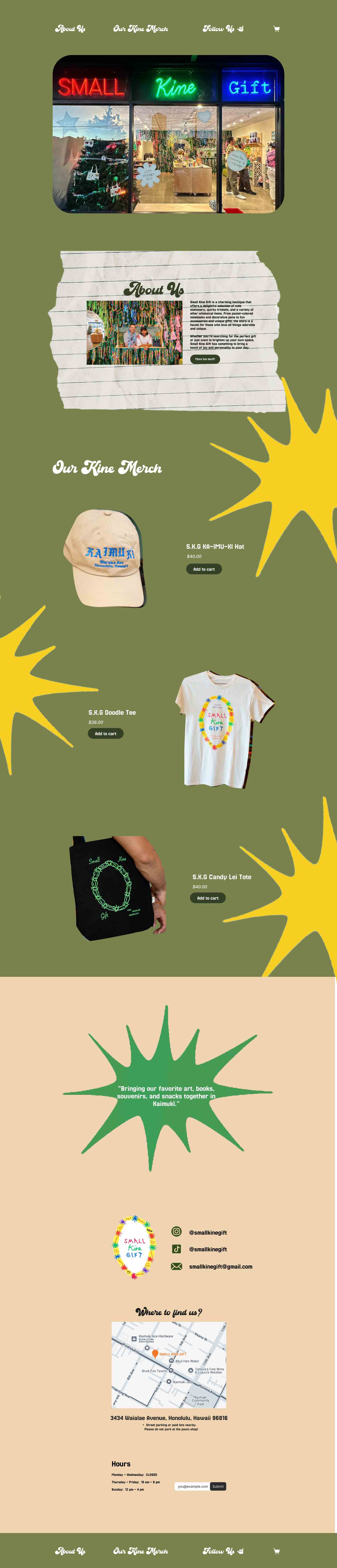
The final iteration
With much decisions to make, I decided on merging both style tiles which resulted into the current implemented interface, using Figma for the final prototype before heading on to coding it.
The scrapbook-themed website leans into a fun, handmade vibe that feels like a digital collage. The layout isn’t super rigid, instead, it’s a bit messy on purpose; with overlapping images, slight rotations, and scattered elements to give it that scrapbook feel.
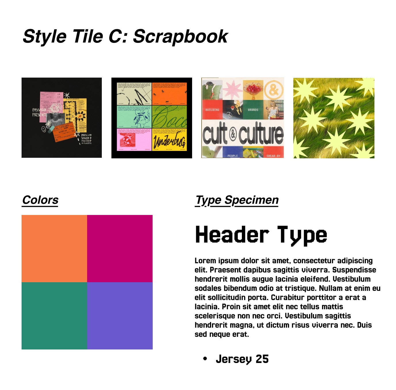
The final wireframe

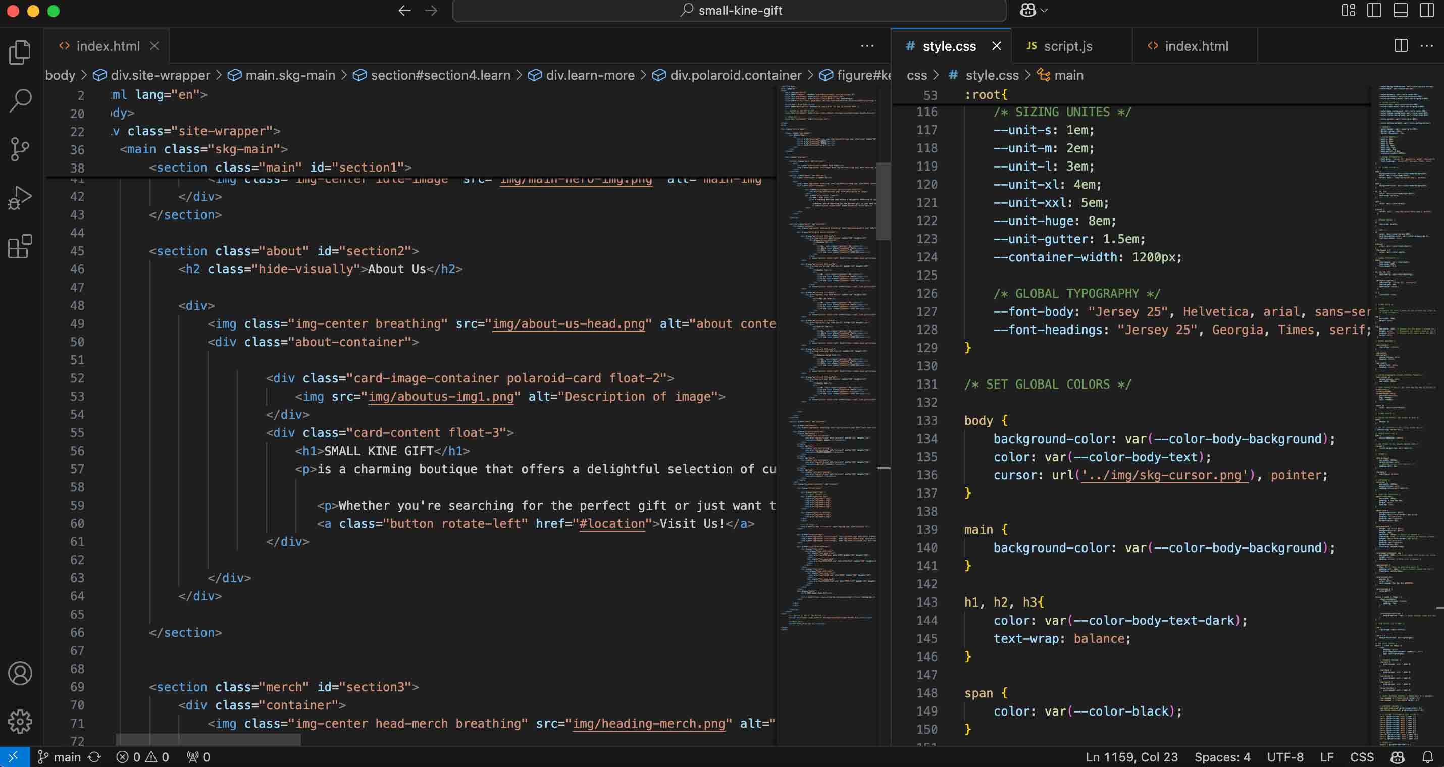
Coding the website
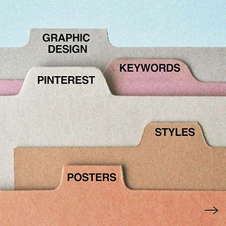
I realized that coding the website would be quite a challenge and that not everything in the Figma file would be the same as the coded site. So, I made sure to implement the important features such as the folder-style navigation and most of the styling in the site.
There are some features that are achievable and some that are not due to the short amount of time but regardless of those technicalities, it was a learning curve and a fun project to work on.
Check out the website!